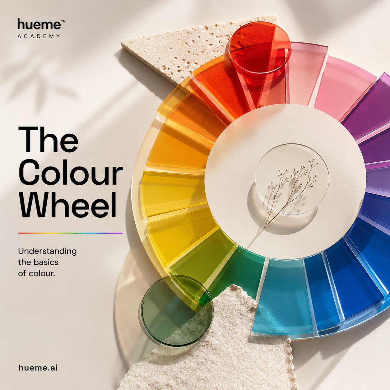
01 · Foundations
The colour wheel, explained.
A simple guide to the wheel every artist, stylist and analyst keeps coming back to. What the outer ring really shows, and what the inner rings are doing.
4 min read · Hueme Academy
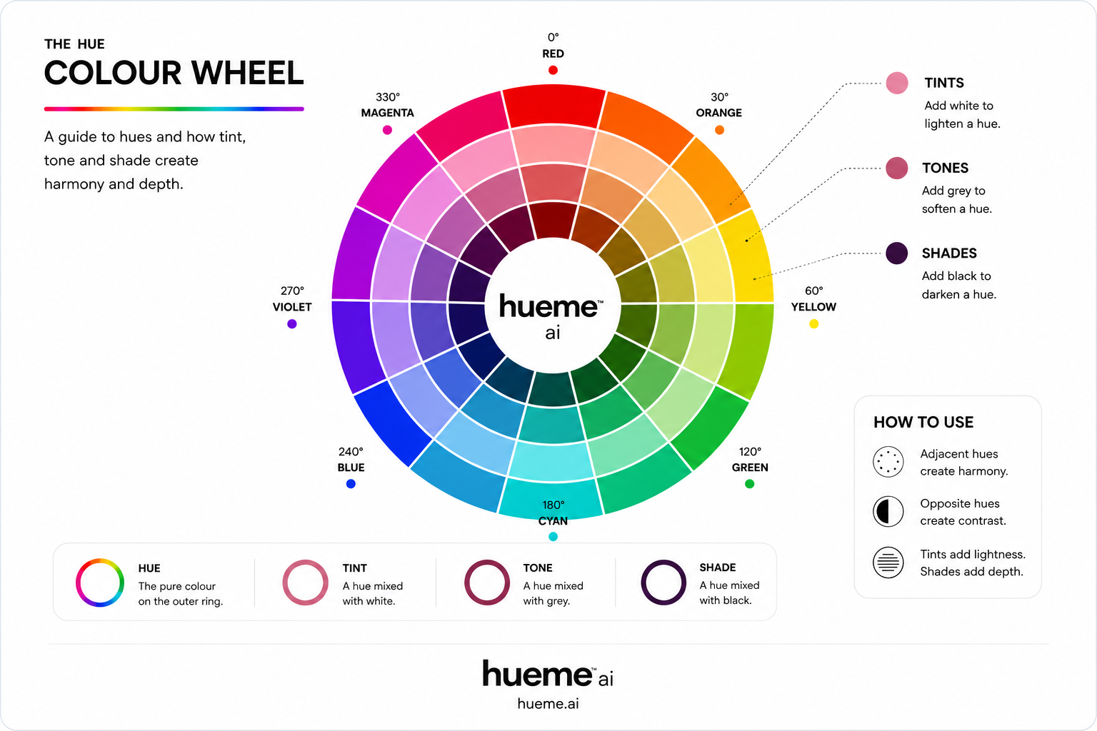
What the wheel is
The colour wheel is a map. It takes the visible spectrum, bends it into a circle, and shows you how every hue relates to every other hue at a glance. Red sits at 0°, green at 120°, blue at 240°. Opposites face each other across the centre. Neighbours sit shoulder to shoulder.
Most modern wheels show twelve hues. That's enough to feel rich without becoming hard to read. The Hueme wheel uses those twelve as its outer ring.
Hue is the pure colour
Hue is what you call a colour when you point at it. Red. Orange. Blue. It lives on the outer ring. Nothing has been added to it yet.
Tint, tone and shade
The inner rings show what happens when you start mixing. Each one tells a different story.
- Tint. Add white. The hue becomes lighter and softer. Think peach from orange, or blush from red.
- Tone. Add grey. The hue becomes quieter and more grown up. Dusty rose, sage, muted teal.
- Shade. Add black. The hue becomes deeper and more serious. Burgundy, forest, navy.

How colours relate
Two rules do most of the heavy lifting. Adjacent hues create harmony, because they share pigment. Opposite hues create contrast, because they cancel each other out. Six classical relationships sit on top of those two ideas — and they're the same rules a stylist reaches for when building an outfit.
- Monochromatic. One hue in different tints, tones and shades. Quietly confident — think head-to-toe burgundy.
- Analogous. Three neighbours on the wheel. Soft and easy to wear — coral with pink and rust.
- Complementary. Direct opposites. Maximum contrast — red with teal, blue with orange.
- Split complementary. A base plus the two neighbours of its complement. Striking but a little softer than full contrast.
- Triadic. Three hues evenly spaced. Playful and balanced — red, blue and green together.
- Square (tetradic). Four hues in a square. Bold and full-spectrum — best with one hero colour and three supports.
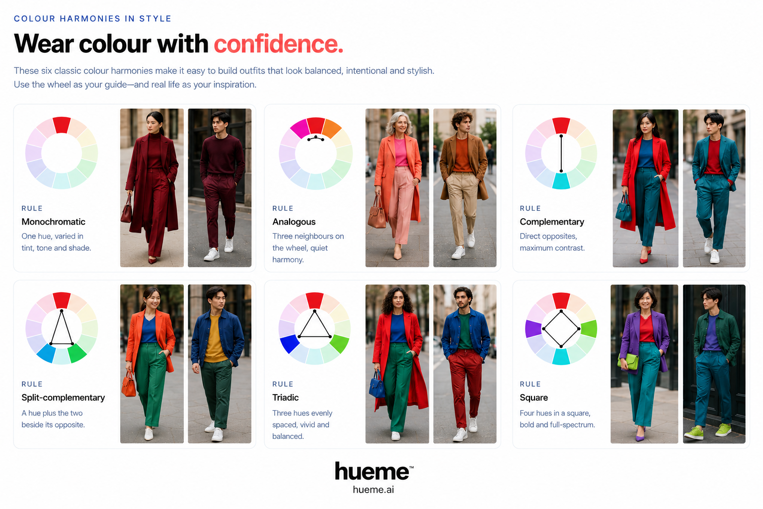
These six rules are why some outfits feel resolved and others feel accidental. The wheel isn't a constraint — it's a shortcut to colour combinations that already work.
Where it goes next
Once the wheel makes sense, the rest of colour theory opens up. Primary, secondary and tertiary colours show you where each hue comes from. Temperature tells you whether a colour leans warm or cool. Seasonal analysis takes all of it and asks one question: which slice of this wheel belongs to you?
Want to play with it? Try the interactive wheel and click through the harmony rules.