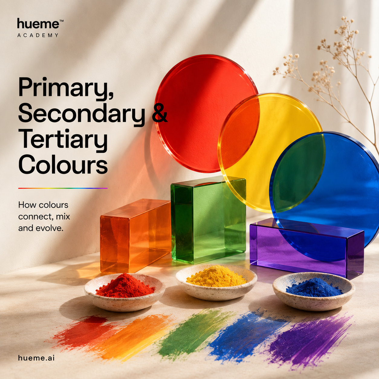
01 · Foundations
Primary, secondary & tertiary.
Three small families sit underneath every palette you've ever loved. Once you can name them, the wheel stops feeling mysterious.
4 min read · Hueme Academy
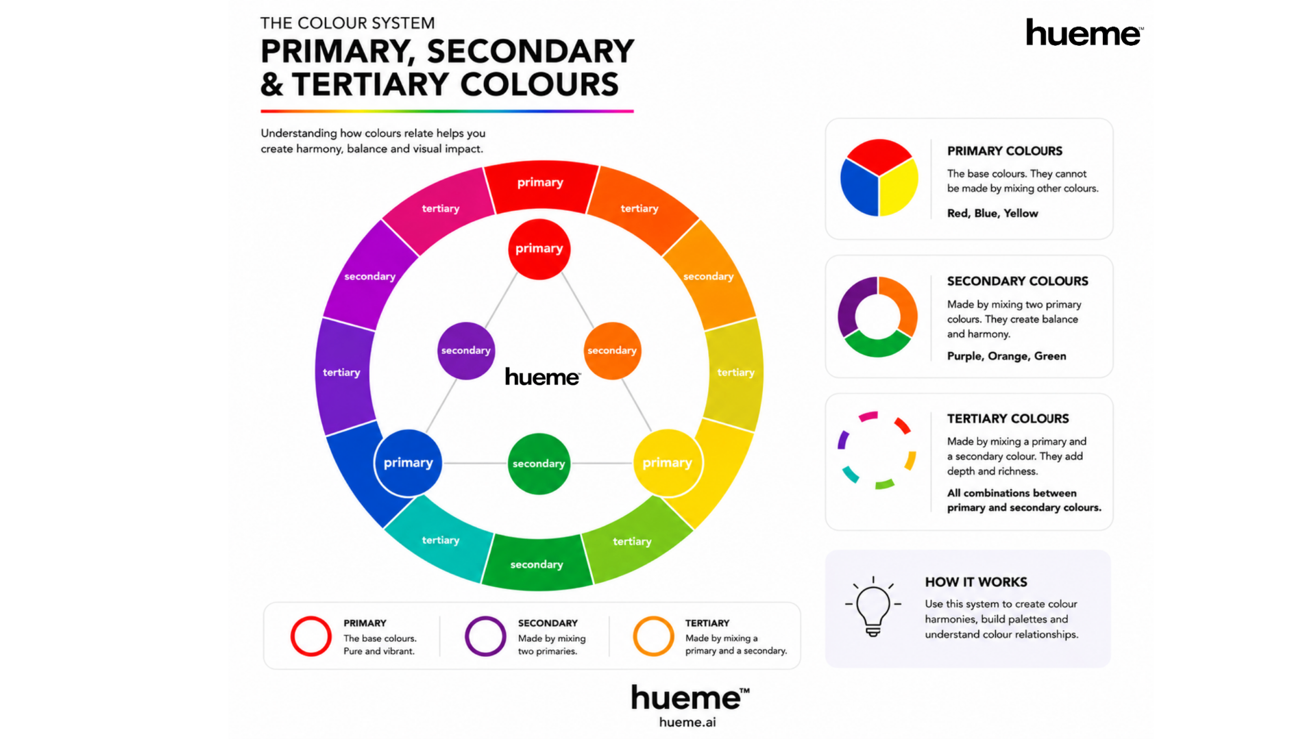
Primary colours
Red, blue and yellow. These are the base colours of traditional colour theory. You can't make them by mixing anything else, which is why they're called primary. Everything else on the wheel starts here.
Secondary colours
Mix two primaries and you get a secondary. Red and yellow give orange. Yellow and blue give green. Blue and red give purple. Three primaries, three secondaries, sitting neatly between them on the wheel.
Tertiary colours
Mix a primary with the secondary next to it and you get a tertiary. That's where the wheel gets interesting. Red orange. Yellow orange. Yellow green. Blue green. Blue violet. Red violet. Six tertiaries fill the gaps and give the wheel its full twelve hues.

Why it actually matters
Knowing the family a colour belongs to tells you how it will behave. Primaries feel pure and confident. Secondaries feel balanced. Tertiaries feel sophisticated, because they carry a little of everything.
It also makes palette building much faster. Pick a primary you love. Add the tertiaries either side of it. You've got an analogous palette in under a minute, and it will almost always work.
A note on light and pigment
Red, blue and yellow are the traditional primaries used in paint, art and most colour analysis. Screens use a different set, red, green and blue, because they mix light rather than pigment. Both systems are correct. We use the traditional set across Hueme because that's the language stylists, analysts and designers share.