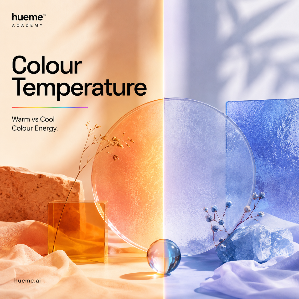
01 · Foundations
Warm, cool & neutral.
Every colour leans somewhere. Once you can feel which way it leans, the seasons start to make sense.
5 min read · Hueme Academy
Going deeper
The full story on warm and cool colours.
A dedicated guide on undertones, contrast and why temperature is the single most important read in colour analysis.
Learn more about warm & cool coloursWhat temperature actually means
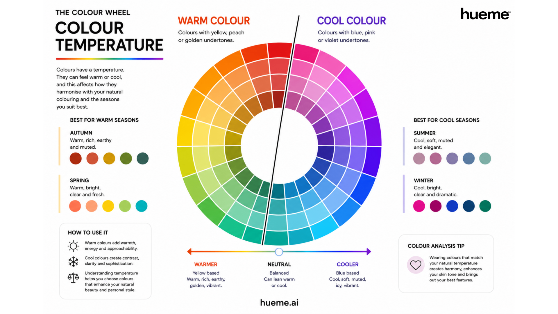
Colour temperature is the warmth or coolness you sense inside a hue. Warm colours lean toward yellow, peach and gold. Cool colours lean toward blue, pink and violet. It isn't about how a colour looks in a photograph. It's about the undertone you can feel when you sit with it for a moment.
The warm side of the wheel
Reds, oranges, yellows and yellow greens carry warmth. They feel like sunlight, spice, terracotta, honey. Most people read them as approachable and energetic. On the face, warmth tends to soften and glow.
The cool side of the wheel
Blues, blue greens, violets and pinks sit on the cool side. They feel like water, slate, lavender, ice. They read as calm, clear and sophisticated. On the face, coolness tends to sharpen and clarify.
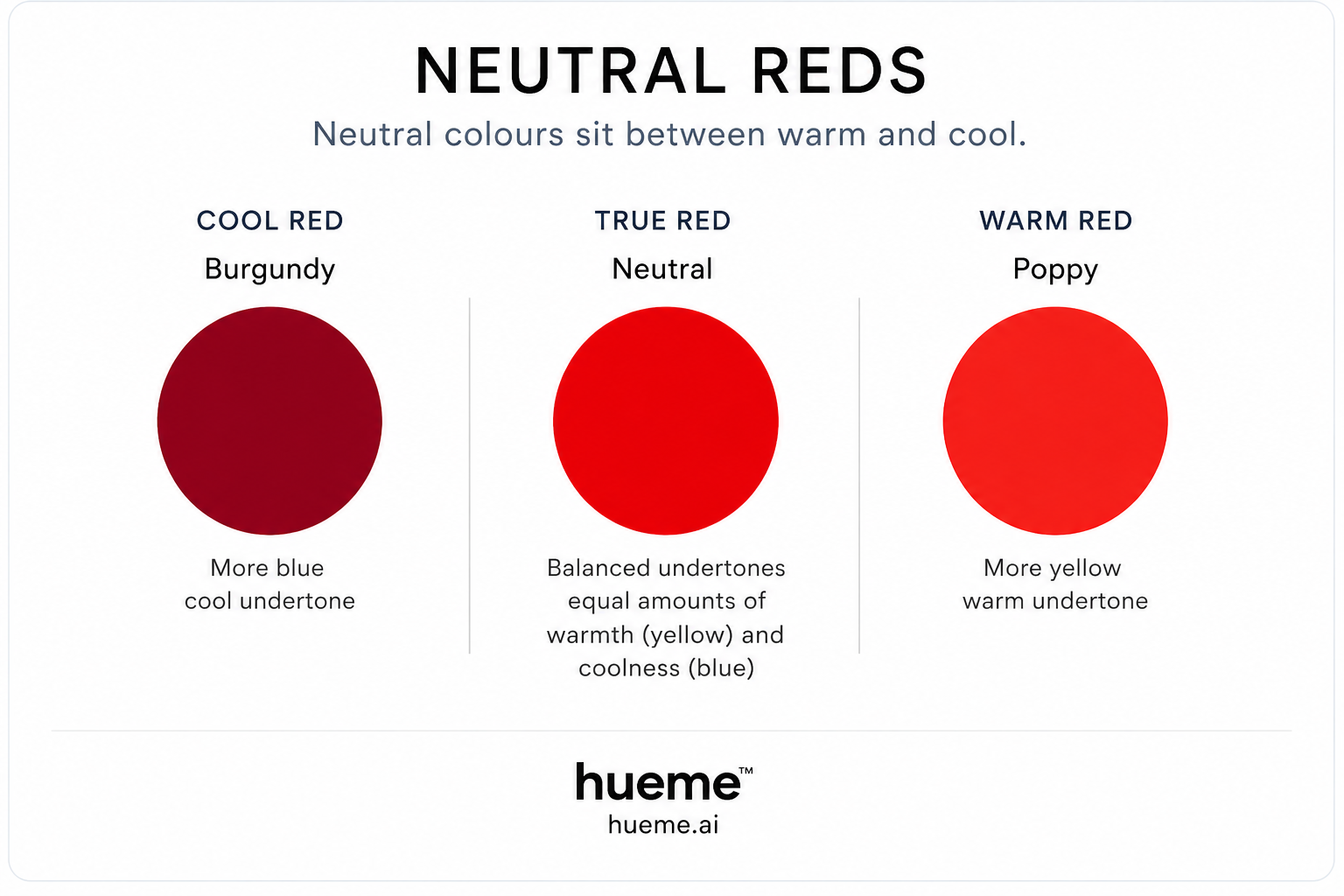
Neutral is real too
Not every colour picks a side. Some balance perfectly in the middle and will lean warm or cool depending on what sits next to them. Most wearable wardrobes have a quiet base of these neutral tones, with warm or cool accents on top.
Temperature and the seasons
This is where colour analysis begins. Two of the four seasons sit on the warm side of the wheel, and two sit on the cool side.
- Spring. Warm, bright, clear and fresh. Coral, peach, warm green, sunlit blue.
- Autumn. Warm, rich, earthy and muted. Rust, mustard, olive, deep teal.
- Summer. Cool, soft, muted and elegant. Dusty rose, mauve, soft blue, sage.
- Winter. Cool, bright, clear and dramatic. Fuchsia, true red, deep blue, emerald.
In short: Spring and Autumn are warm. Summer and Winter are cool. Everything else in seasonal analysis — chroma, value, contrast — layers on top of that one read.
Warm and cool on the face
Temperature is easiest to see on real skin. Here is one face per season — what to notice is the colouring, not the person.
Each season is a family of colours, not a person. Spring colours are bright and clear — think Crayola at its happiest. Autumn colours are warm and muted — leaves, spice, weathered leather. Summer is soft and cool, like sea glass. Winter is cool and vivid, like ink on snow. The portraits below show one person who naturally lives inside each of those colour worlds.
Temperature
WARM — Spring & Autumn
Golden, peach, honey undertones. Colours that feel sunlit on the skin.
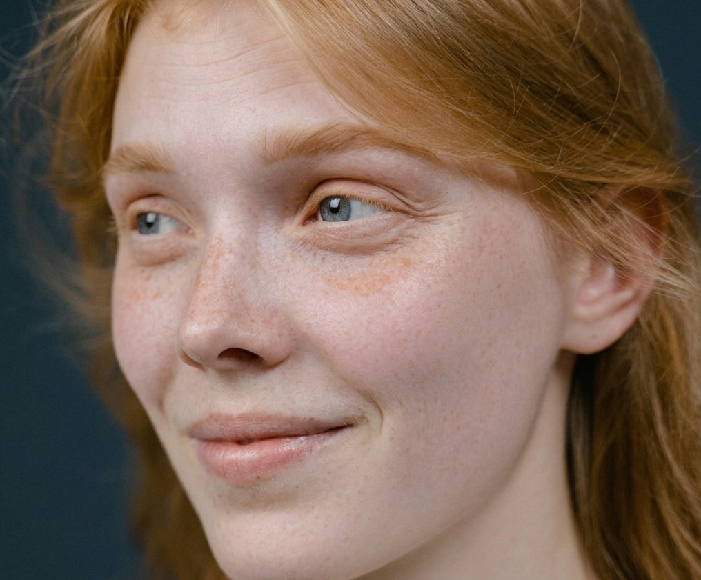
Spring · warm
- Glowy complexion
- Bright eyes
- Clear, fresh contrast
Warm coral and peach light her up; muddy or icy tones flatten her.
Sub-seasons
True Spring · Bright Spring · Light Spring
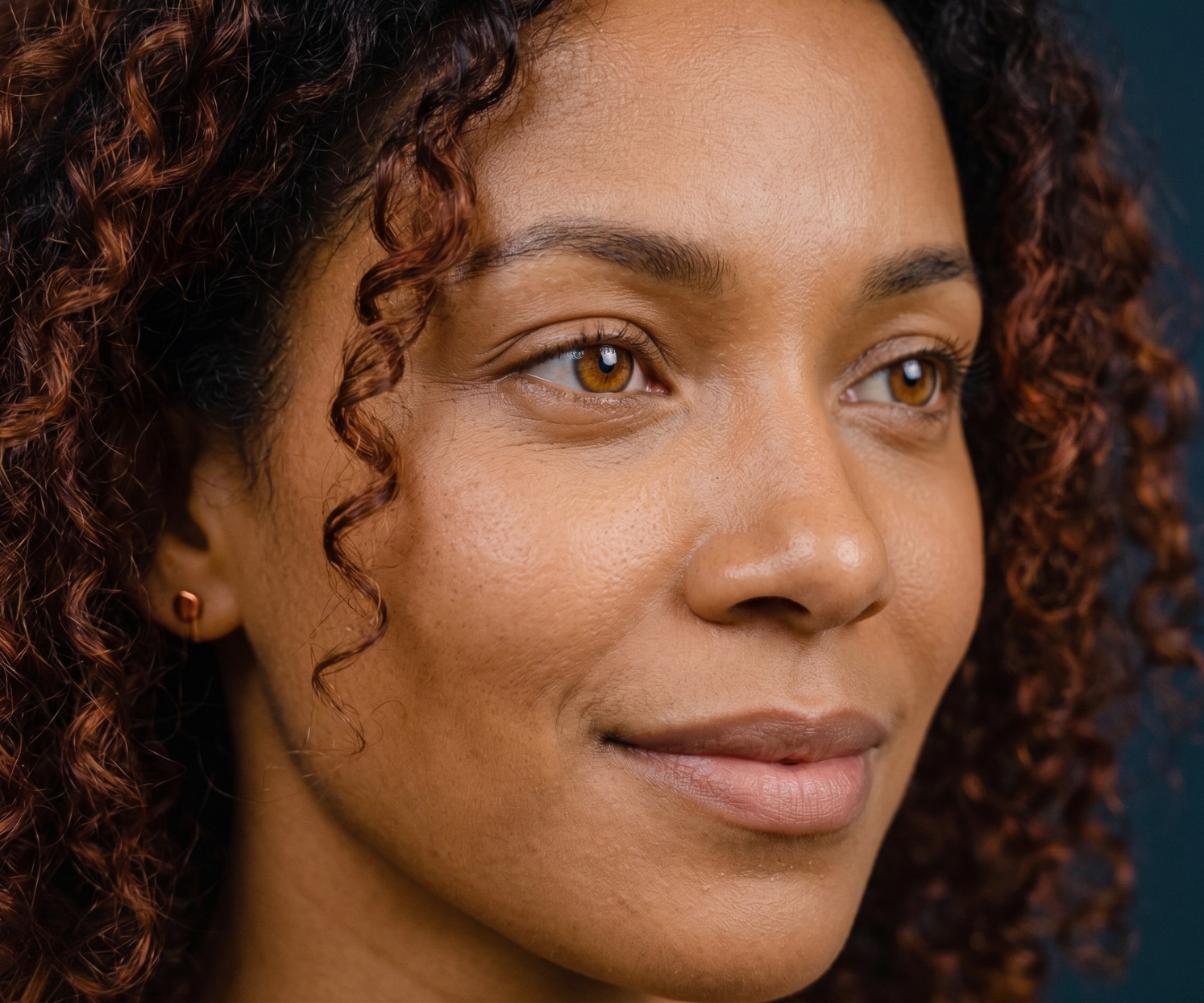
Autumn · warm
- Rich golden warmth
- Soft contrast
- Earthy depth
Rust, olive and bronze read as natural; pure white and icy pink fight her.
Sub-seasons
True Autumn · Soft Autumn · Deep Autumn
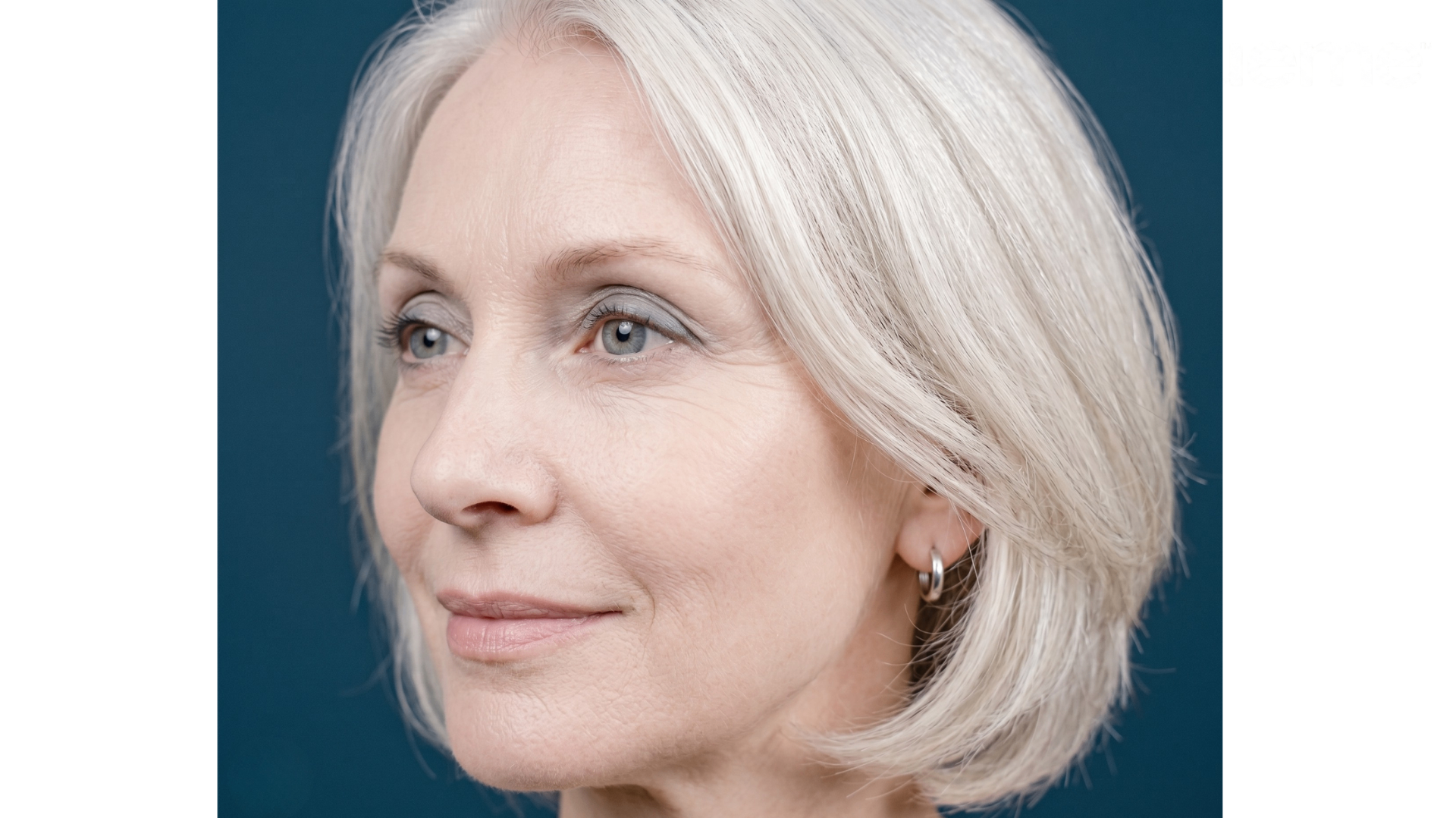
Temperature
COOL — Summer & Winter
Rose, blue and porcelain undertones. Colours that feel clear and quiet on the skin.
Summer · cool
- Cool soft skin
- Muted, blended features
- Low contrast
Dusty rose, mauve and sage feel like home; orange and gold turn sallow.
Sub-seasons
True Summer · Soft Summer · Light Summer

Winter · cool
- Cool deep skin
- High contrast
- Clear, vivid features
Pure red, ink-blue and emerald feel native; muted earthy tones go flat.
Sub-seasons
True Winter · Bright Winter · Deep Winter
How to use it
Match temperature first, everything else after. A warm pink on a cool person will fight the face. A cool blue on a warm person will drain it. Choose the temperature your own colouring leans toward and the rest of the palette starts to feel obvious.
Want to see it on the wheel? Open the interactive wheel and switch between harmonies on warm and cool hues.